Oqto
A new design system for Oqto, from colours and typography to components, and a redesign of the accounting platform and mobile app built on it.

Challenge
Oqto’s product had been designed by the people building it. They needed a design system clear enough to use on their own afterwards, so the product stays consistent as it grows. The design also had to meet contrast requirements, fix the most obvious UX problems and reflect Oqto’s brand, on the web and in the app.
Process
01 FoundationColours and typography
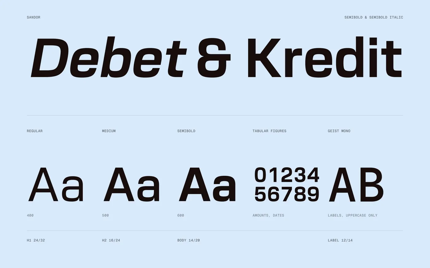
The system starts small. Sand, Mist, Orange and Ink carry the whole product and give it a look you don’t expect from an accounting service. Sandor is the primary typeface, with Geist Mono in capitals for labels.
#F1EFEC
#D7E9FB
#FF6319
#160D0B
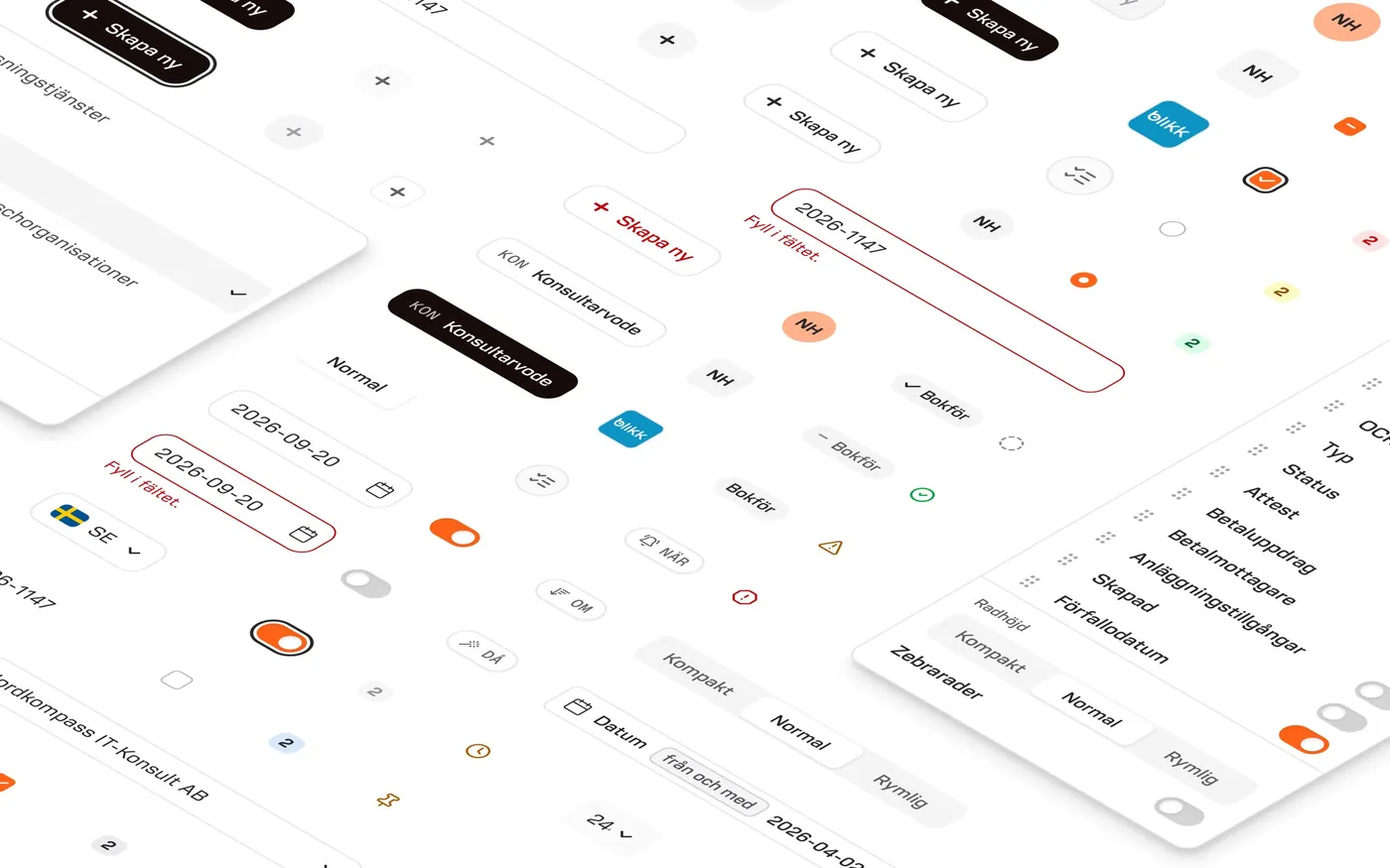
Components for a dense product
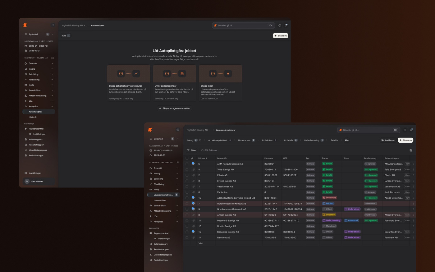
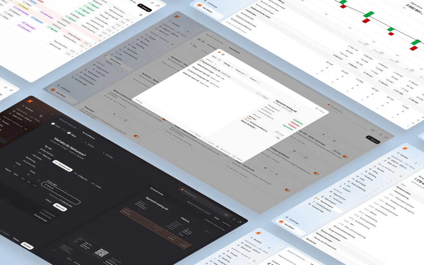
Buttons, fields, chips, menus and tables, each with its states. The Figma library and its written guidelines are connected to Claude Code, so new features follow the system from the start. Everything works in light and dark mode.
Key screens, rebuilt
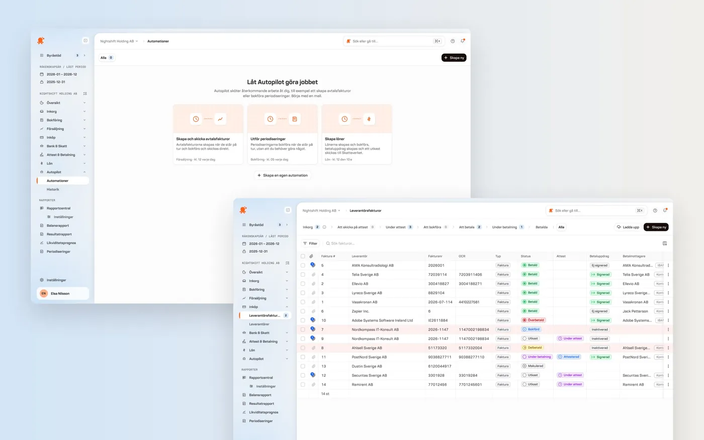
I redesigned a selection of screens chosen to cover as much of the product as possible, and reworked the flows that needed bigger changes. Below is the same screen before and after the redesign.

 Before
After
The same system in your pocket
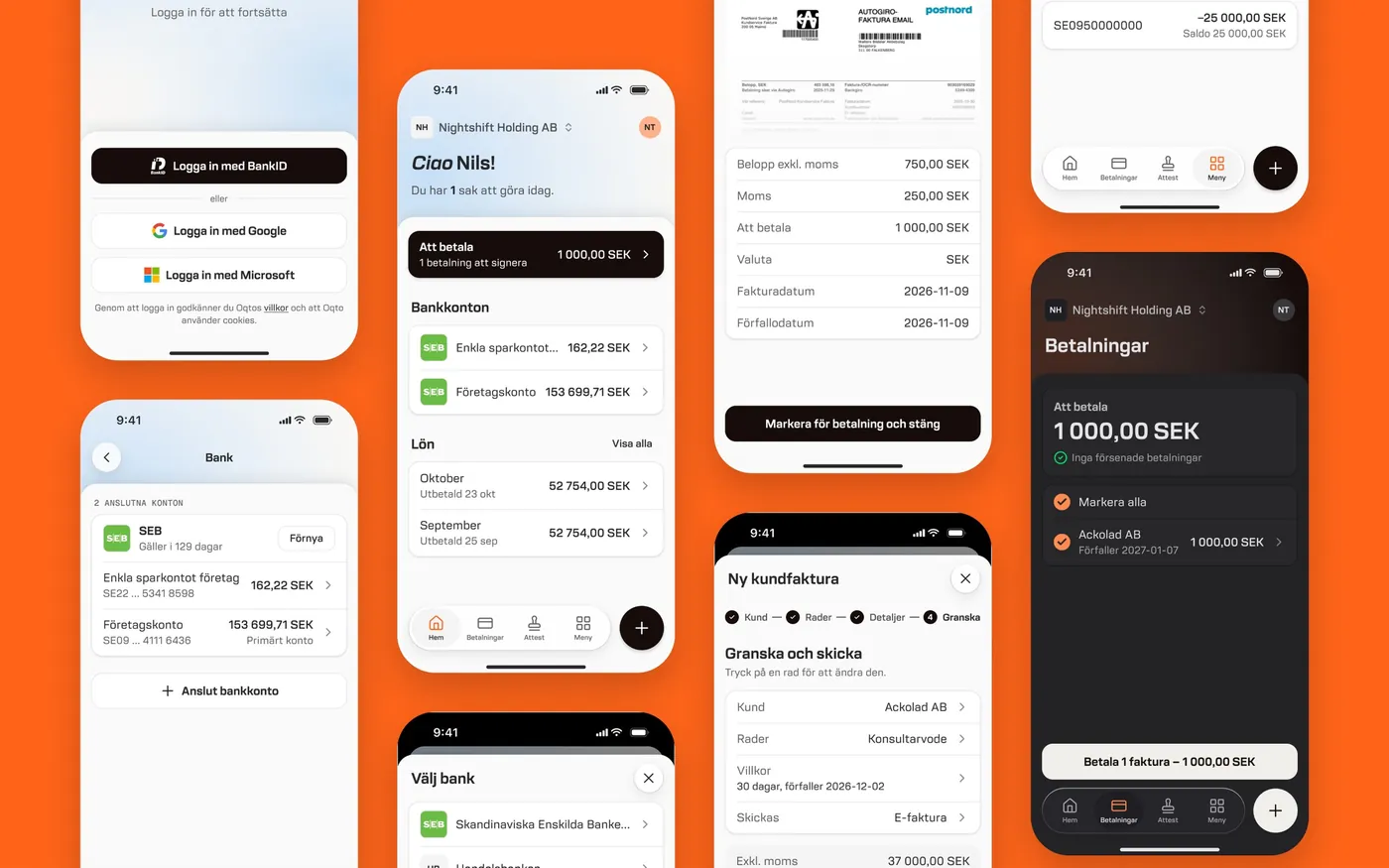
The app covers what you need on the go: bank accounts, payments to sign, payroll and invoices, with the same components and tone as the web product.
Outcome
Oqto now has a design system the team can keep building with on their own, and a product that looks and works the same on web and in the app. It’s made for accounting firms, but feels as simple as a consumer app.
Next project
Tink · Senior Product Designer
Contact
Have a project in mind?
henrikhedvall@gmail.com